
Mr. Bellino’s Graph of the Month
June 9, 2018
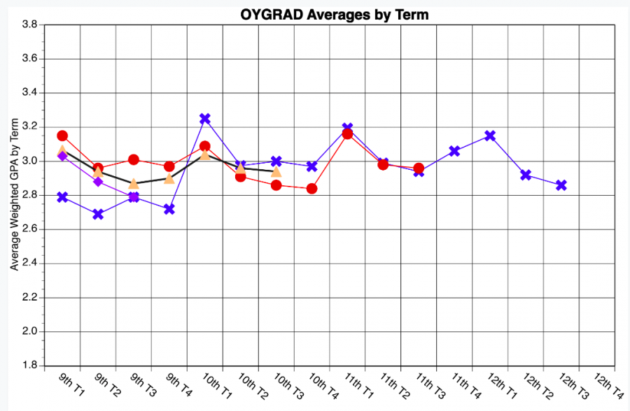
We’re back. Your humble graph analysts. After a month-long hiatus, we’ve returned with some striking Wilson data you didn’t even know you wanted. This graph, created by the benevolent Joseph Bellino, shows the average weighted grade point average (GPA) for each grade at Wilson. Weighted GPAs give a set boost to a students average for each honors and AP class.
The first thing that we would like to call your attention to as you are marveling at the intrigue of this graph is the increase in GPA that each class sees at the first term of every year. This doesn’t seem all that surprising—there’s a general culture of optimism and enthusiasm as each school year begins.
The second point of interest is that this year’s freshmen had the second lowest GPA in the first term of freshman year of any grade currently at Wilson, and has continued on a downward trend since then. This could be a result of Honors for All, a policy instituted this year that places all freshmen in honors, rather than on-level, Biology and English. In the past, the freshman class has been split between the two levels, but the change was made in an effort to combat Wilson’s consistent achievement gap. The increased rigor for freshman could be the cause of this comparative low and the negative pattern.
The third, final and arguably most perplexing data point on the graph fell during the first term of the class of 2018’s 10th grade year. At that point, the current seniors made an almost .7-point jump in GPA, the largest term-to-term difference seen at Wilson in the past four years. Not even Wilson and The Beacon’s faithful graphical gurus can unravel this enigma. We’d like to take this opportunity to invite some hypothesizing from our dedicated readership. Consider the possible reasons motivating this jump, and send us a message at beaconchiefeditor@gmail.com, or contact us through Instagram, Twitter, or Snapchat (@thewilsonbeacon).